
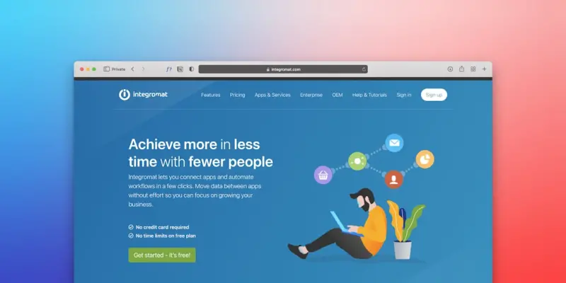
Why “Just Pretty” Isn’t Enough Anymore
When I first cut my teeth on WordPress, the biggest challenge was finding a theme that looked good enough for a client’s launch deadline. Fast forward a few years, and the landscape has shifted dramatically. A theme is now a strategic asset—it must deliver pixel‑perfect design, rock‑solid performance, and the flexibility to evolve without turning the site into a maintenance nightmare.
In this post I’ll walk through the mindset shift you need, the concrete steps to audit your theme stack, and a set‑by‑step roadmap to build a theme that can stand the test of time—no matter how fast the web moves.
1. Stop Chasing Shiny Features, Start Mapping Core Goals
Every theme on the market promises a laundry list of “awesome” features: drag‑and‑drop builders, mega menus, dynamic sidebars, and more. While those bells and whistles can be fun, they often mask deeper issues:
- Performance drag: Every extra script adds latency.
- Code debt: Over‑engineered options lead to tangled PHP and JavaScript.
- Brand drift: Too many configuration knobs make it hard to enforce visual consistency.
Instead of counting features, start by defining core goals for the theme:
- Speed as a ranking factor. Aim for a TTFB under 200 ms and a LCP below 1.2 s on a typical 3G connection.
- Scalable styling. Use a system that lets designers adjust colors, spacing, and typography without touching code.
- Future‑proof architecture. The theme should be ready for headless integrations, block‑based editing, and emerging web standards.
When you measure every decision against these goals, the “must‑have” features become clear—and everything else can be trimmed away.
2. Conduct a Performance Health Check
Before you refactor, you need a baseline. Run a quick audit using Lighthouse, WebPageTest, or your favorite RUM tool. Capture these metrics:
- First Contentful Paint (FCP)
- Speed Index
- Total Blocking Time (TBT)
- Number of third‑party requests
If any of these numbers are in the red, you have a performance problem to solve before you even think about aesthetics. Common culprits include:
- Heavy page‑builder assets that load on every page.
- Unoptimized images baked into the theme’s demo content.
- Bloated CSS that ships the entire framework even when only a few components are used.
Once you have the numbers, set concrete improvement targets. For example, reduce TBT by 40 % or cut third‑party requests in half. Those targets will guide your subsequent decisions.
3. Embrace a “Style Variables System” for Consistency
One of the biggest pain points I’ve seen is designers manually tweaking CSS values across dozens of files. The result? Inconsistent margins, mismatched colors, and a nightmare when a brand refresh rolls around.
Enter a style variables system. By defining a set of custom properties (CSS variables) for colors, spacing, typography, and breakpoints, you give every component a single source of truth.
Here’s a quick starter:
:root {
    --brand-primary: #0052cc;
    --brand-accent: #ff4081;
    --space-unit: 0.75rem;
    --font-base: 'Inter', sans-serif;
    --font-size-base: 1rem;
    --radius-sm: 4px;
}
All your component CSS then references these variables. When the brand decides to switch the primary hue, you change one line and the whole site updates instantly. No more hunting for “#0052cc” in 30 different places.
Beyond consistency, this approach pairs nicely with modern browsers’ native support for prefers-color-scheme and dynamic theming, keeping your theme lightweight and future‑ready.
4. Modularize with Block‑Based Templates
Since WordPress introduced the full‑site editing (FSE) experience, the old PHP‑template hierarchy is no longer the only way to structure a theme. Block‑based templates let you build reusable page sections—headers, footers, and content areas—using the same block editor that content creators already love.
Benefits include:
- Designer autonomy: Content editors can rearrange blocks without touching code.
- Reduced duplication: A single block definition can serve multiple page types.
- Better version control: Blocks are stored as JSON, making diffs cleaner.
To get started, create a theme.json file that defines your global settings and block styles. Then, scaffold a few starter templates in the templates/ folder—header.html, footer.html, and a generic page.html. From there, you can export a reusable block pattern library that your team can import into any new site.
5. Keep JavaScript Light, Use Native APIs When Possible
Many themes ship with massive JavaScript bundles just to power a “sticky header” or a “smooth scroll” effect. In most cases you can achieve the same result with native browser APIs, which are faster and have a smaller footprint.
Consider the advanced CSS APIs that let you animate layout changes without a single line of JavaScript. For sticky navigation, a simple position: sticky rule does the trick in modern browsers. For lazy loading images, the loading="lazy" attribute removes the need for a third‑party script.
When you do need custom interactivity, prefer lightweight frameworks like Alpine.js or vanilla ES modules. Avoid pulling in entire libraries (e.g., jQuery) unless they are truly essential.
6. Plan for Headless Consumption Early
Even if you’re not ready to go fully headless, treating your theme as an API provider can pay dividends later. Expose key data (menus, site metadata, custom fields) via the REST API or GraphQL. That way, if a future project demands a React front‑end, you won’t need to rebuild the data layer from scratch.
Tip: add a register_rest_route callback that returns a clean JSON representation of your navigation structure. Keep it lean—only the fields the front‑end truly needs. This practice also improves accessibility for third‑party integrations like mobile apps or IoT dashboards.
7. Adopt a “Performance‑First” Development Workflow
Performance isn’t a one‑time checklist; it’s a habit. Integrate automated testing into your CI pipeline:
- Run Lighthouse CI on every PR. Block merges that cause a regression in LCP or TBT.
- Use a CSS analyzer. Tools like
cssstatscan flag unused selectors. - Bundle analysis. Ensure your JS bundles stay under a target size (e.g., 150 KB gzipped).
When your team treats performance as a first‑class citizen, you catch issues before they become costly refactors.
8. Documentation Is the Unsung Hero
A theme that lives beyond the original developer must be well‑documented. Include:
- A
README.mdthat explains the design token system, block patterns, and how to override styles. - Inline PHPDoc comments for every function and hook.
- Guidelines for adding new blocks without breaking the global
theme.json.
Good documentation reduces onboarding time, minimizes accidental breakage, and preserves the theme’s architectural integrity as the team scales.
9. Regularly Prune and Refactor
Even the best‑designed theme will accrue technical debt over time. Set a quarterly “theme health” sprint where you:
- Remove any unused templates, block patterns, or CSS rules.
- Update dependencies (e.g., replace outdated polyfills).
- Re‑run your performance audit and compare against the baseline.
This disciplined approach keeps the codebase lean and ensures the theme remains aligned with the core goals you established at the outset.
10. Case Study: From Bloated Builder to Lean Block‑First Theme
One of our clients started with a popular multipurpose theme that bundled a visual page builder, dozens of pre‑made demos, and a massive CSS framework. Their site suffered from slow load times, and the marketing team constantly fought with developers to keep the brand style consistent.
We applied the methodology outlined above:
- Defined core goals (speed, consistency, scalability).
- Performed a performance audit that revealed a 3‑second LCP.
- Switched to a responsive layout tricks approach using native CSS grid and custom properties.
- Implemented a style variables system to centralize brand colors and spacing.
- Rebuilt the site with block‑based templates and exported a pattern library for the marketing team.
Result? LCP dropped to 1.1 seconds, the brand’s visual guidelines were enforced automatically, and the content editors could create new pages without developer assistance. The theme’s codebase shrank by 45 %, and future upgrades became a matter of pulling the latest block definitions.
Wrapping Up
WordPress themes have evolved from static HTML skins into dynamic, data‑driven platforms. By focusing on performance, a solid style variables system, block‑based architecture, and a disciplined workflow, you can craft a theme that not only looks great today but also adapts gracefully to tomorrow’s web innovations.
Remember: a theme is an investment. Treat it like any other product—plan, measure, iterate, and document. The effort you put in now will save countless hours of firefighting down the road.

Alex Moss is a digital marketing professional and SEO consultant, focusing on technical and structural SEO along with product development. With more than six years of experience in various facets of digital marketing, he has assisted brands of all sizes in establishing and enhancing their online presence, as well as fostering increased product loyalty.
Related Posts
AI‑Augmented WordPress Themes: A New Frontier for B2B SaaS
AI‑augmented WordPress themes bridge design tokens and code, delivering faster page builds, consis... Read More
Turning WordPress Themes into a Recurring Revenue Engine
Explore a subscription‑based approach to WordPress theme development, covering modular architectur... Read More
Performance‑First WordPress Themes: The Competitive Edge for SaaS
A performance‑first WordPress theme eliminates bloat, improves Core Web Vitals, and drives higher ... Read More
Top Posts

Rethinking jQuery: A Pragmatic Playbook for Modern SaaS Teams
A practical guide for SaaS engineers on auditing legacy jQuery, building façade wrappers, testing mixed codebases, and planning incremental migration without d...Read More

Going Headless with Joomla: An API‑First Strategy for Modern Web Experiences
Discover how to convert Joomla into a headless CMS, leverage its native APIs, and integrate with modern front‑end frameworks to deliver faster, omnichannel ex...Read More

Why Progressive Web Apps Are the Secret Weapon for Modern E‑Commerce
Progressive Web Apps deliver an app‑like, fast, and offline‑ready experience for shoppers, driving higher conversions and lower bounce rates without the com...Read More
Server‑Driven UI: Rethinking Mobile Web Development
Server‑driven UI flips the traditional mobile web stack by moving layout decisions to the backend, delivering tiny JSON payloads that render instantly on devi...Read More
0 Comments
Post Comment
You will need to Login or Register to comment on this post!