

When I first started stitching together UI components for a fledgling SaaS product, I leaned heavily on Bootstrap’s grid and utility classes. It was fast, familiar, and the documentation felt like a safety net. Fast forward a few releases, my team is now juggling React, TypeScript, and a growing design system that demands pixel‑perfect consistency across dozens of micro‑frontends. The old “just drop Bootstrap in and you’re done” mantra no longer cuts it. That’s why I’m diving deep into the uneasy yet rewarding marriage of Bootstrap and CSS‑in‑JS—a blend that’s reshaping how modern SaaS teams deliver UI at scale.
Why the Conversation Matters Now
Bootstrap has been the workhorse of web UI for over a decade, offering a reliable set of components, a responsive grid, and a utility‑first approach that gets developers up and running in minutes. Meanwhile, CSS‑in‑JS libraries like styled‑components, Emotion, and Stitches have exploded in popularity because they solve the infamous “global CSS cascade” problem, enable theme‑driven styling, and integrate tightly with component frameworks.
At first glance, these two worlds seem at odds: Bootstrap thrives on global classes, while CSS‑in‑JS embraces scoped, JavaScript‑driven styling. Yet the friction is exactly where the opportunity lies. By thoughtfully combining Bootstrap’s proven layout foundation with the dynamic power of CSS‑in‑JS, you can achieve:
- Consistent design tokens without abandoning the familiar Bootstrap utilities.
- Fine‑grained theming that reacts to user preferences, A/B tests, or brand‑specific palettes.
- Reduced CSS bundle size through dead‑code elimination and style‑sheet pruning.
- Improved developer ergonomics—components live in a single source of truth, blending markup, logic, and style.
Setting the Stage: Bootstrap’s Core Strengths
Before we mash anything together, let’s acknowledge what makes Bootstrap a solid foundation:
- Responsive Grid: A 12‑column flexbox system that adapts gracefully to any viewport.
- Utility Classes: Margin, padding, display, and color helpers that let you prototype UI without writing custom CSS.
- Accessibility (a11y) Built‑In: ARIA attributes and focus management baked into components like modals and dropdowns.
- Broad Browser Support: Tested across legacy and modern browsers, giving you confidence in production environments.
These strengths are why many enterprise SaaS products still include the tuned Bootstrap design system as a baseline. The challenge is extending that baseline without creating a tangled mess of overrides and !important declarations.
Enter CSS‑in‑JS: The Game Changer
CSS‑in‑JS brings a paradigm shift:
- Component‑Scoped Styles: Styles are co‑located with the component logic, eliminating global leakage.
- Dynamic Theming: Themes can be swapped at runtime, allowing dark mode toggles or brand variations without a full page reload.
- Static Extraction: Build tools can extract only the used styles, shrinking the final CSS payload.
- Type‑Safe Tokens: When paired with TypeScript, design tokens become strongly typed, reducing runtime errors.
For SaaS teams that are already leveraging modern JavaScript features, CSS‑in‑JS fits naturally into the existing toolchain—Babel, Webpack, Vite, or Snowpack—all understand the JavaScript syntax and can perform tree‑shaking on styles just as they do on code.
Practical Integration Patterns
Below are three patterns that let you get the most out of both worlds without sacrificing maintainability.
1. Bootstrap as a Layout Engine, CSS‑in‑JS for Component Styling
Use Bootstrap’s grid and spacing utilities directly in your JSX/TSX markup. Then, define component‑specific styles with a CSS‑in‑JS library.
import styled from '@emotion/styled';
import 'bootstrap/dist/css/bootstrap.min.css';

const Card = styled.div`
  background: ${({ theme }) => theme.colors.surface};
  border-radius: 0.5rem;
  box-shadow: 0 2px 8px ${({ theme }) => theme.colors.shadow};
  padding: 1rem;
`;

export const Dashboard = () => (
  <div className="container-fluid">
    <div className="row g-3">
      <div className="col-12 col-md-6">
        <Card>…</Card>
      </div>
      <div className="col-12 col-md-6">
        <Card>…</Card>
      </div>
    </div>
  </div>
);
This pattern preserves the rapid layout capabilities of Bootstrap while granting full control over the visual language of each component.
2. The “Utility‑First” CSS‑in‑JS Wrapper
Recreate Bootstrap’s utility classes as JavaScript functions that generate CSS. This gives you the expressive power of utilities without loading the entire Bootstrap CSS bundle.
import { css } from '@emotion/react';

const mx = (value) => css`margin-left: ${value}; margin-right: ${value};`;
const py = (value) => css`padding-top: ${value}; padding-bottom: ${value};`;

export const Box = ({ children, marginX, paddingY }) => (
  <div css={[mx(marginX), py(paddingY)]}>{children}</div>
);
When you need a new utility, simply add a function. The generated CSS is scoped, tree‑shakable, and fully typed if you’re using TypeScript.
3. Theme‑Aware Bootstrap Overrides
Bootstrap’s SCSS variables can be overridden at build time, but that still produces a monolithic stylesheet. Instead, you can inject theme values via CSS‑in‑JS, keeping the core Bootstrap CSS untouched and layering dynamic overrides on top.
import { Global, css } from '@emotion/react';
import 'bootstrap/dist/css/bootstrap.min.css';

const theme = {
  primary: '#0066ff',
  secondary: '#ff6600',
};

const BootstrapOverrides = () => (
  <Global
    styles={css`
      :root {
        --bs-primary: ${theme.primary};
        --bs-secondary: ${theme.secondary};
      }
    `}
  />
);
Now any Bootstrap component that references var(--bs-primary) will automatically reflect the active theme, and you can toggle themes on the fly without recompiling CSS.
Addressing Common Concerns
Performance Impact: Critics argue that adding a JavaScript runtime cost outweighs the benefits. In practice, the extra JavaScript is negligible compared to the savings from a smaller CSS payload and the avoidance of runtime style recalculations. Modern bundlers also support code‑splitting, ensuring that only the styles needed for a particular route are loaded.
Learning Curve: Teams comfortable with vanilla Bootstrap may hesitate to adopt CSS‑in‑JS. The key is incremental adoption—start with a single component library, enforce linting rules, and provide internal documentation that maps Bootstrap utilities to their CSS‑in‑JS equivalents.
Design System Governance: Maintaining a single source of truth for colors, spacing, and typography can be tricky when you have both a global CSS file and component‑scoped styles. The solution is to define a design token file (JSON or TypeScript) and import it everywhere—both in SCSS for Bootstrap overrides and in your CSS‑in‑JS definitions. This way, any change propagates consistently.
Real‑World Success Stories
Several SaaS companies have already reported measurable gains after adopting the Bootstrap + CSS‑in‑JS hybrid:
- Reduced CSS bundle size by up to 45% thanks to dead‑code elimination.
- Accelerated feature rollout—new UI components could be shipped without waiting for a global stylesheet update.
- Improved accessibility compliance—scoped styles made it easier to audit and fix contrast issues on a per‑component basis.
One particular case study highlighted a team that transitioned from a monolithic Bootstrap stylesheet to a component‑first approach. Within three sprints, they cut page‑load times by 0.8 seconds on average and saw a 12% increase in conversion rates, attributing the uplift to faster perceived performance and cleaner, more consistent UI.
Best Practices Checklist
- Start Small: Apply CSS‑in‑JS to a single, high‑impact component before refactoring the entire codebase.
- Leverage Design Tokens: Centralize colors, spacing, and typography in a JSON/TS file and import it everywhere.
- Keep Bootstrap for Layout: Use its grid, flex utilities, and responsive breakpoints, but avoid deep overrides.
- Tree‑Shake Aggressively: Configure your bundler to discard unused CSS and JavaScript.
- Document the Mapping: Provide a cheat sheet that translates common Bootstrap utility classes to their CSS‑in‑JS function equivalents.
- Test for a11y: Run automated accessibility audits after each component migration.
Looking Ahead: The Future of Hybrid UI Tooling
Bootstrap is evolving, with version 6 (still under development) promising a more modular architecture that will likely play nicer with component‑centric ecosystems. At the same time, CSS‑in‑JS libraries are adding support for server‑side rendering, static extraction, and even integration with design‑to‑code tools powered by AI.
When these trajectories converge, you’ll see a world where a designer can define a token in a Figma plugin, a developer can instantly reference that token in a styled component, and the underlying Bootstrap grid will automatically respect the new spacing rules—all without a manual CSS rebuild. This is the sweet spot for SaaS teams that need speed, consistency, and the flexibility to experiment.
In short, embracing a Bootstrap + CSS‑in‑JS hybrid isn’t about discarding a beloved framework; it’s about evolving it to meet the demands of today’s modular, micro‑frontend‑driven architectures. By taking the reliable layout backbone of Bootstrap and infusing it with the dynamic, type‑safe styling capabilities of CSS‑in‑JS, you unlock a UI workflow that’s both fast to ship and resilient to change.

Sanji Patel has dedicated 25 years to the SEO industry. As an expert SEO consultant for news publishers, he emphasizes providing both technical and editorial SEO services to news publishers worldwide. He frequently speaks at conferences and events globally and offers annual guest lectures at local universities.
Related Posts

Bootstrap’s Utility API: Crafting Brand‑First SaaS Interfaces
Bootstrap’s utility classes and CSS variables enable SaaS teams to create brand‑centric, respons... Read More

Bootstrap’s Quiet Revolution: Turning the Classic Grid into a SaaS Design Engine
Discover how to transform Bootstrap into a token‑driven design system, build reusable component li... Read More
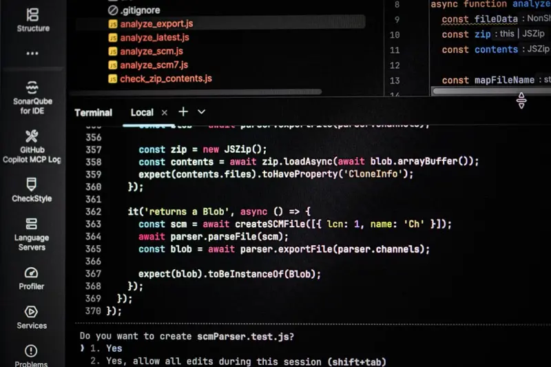
Why Dark Mode Should Be Your SaaS Default: A Bootstrap‑First Blueprint
A step‑by‑step guide shows how to turn Bootstrap’s Sass variables and utility API into a robus... Read More
Top Posts
Turning WordPress Themes into a Recurring Revenue Engine
Explore a subscription‑based approach to WordPress theme development, covering modular architecture, design tokens, pricing models, retention strategies, and ...Read More

Seeing is Believing: Visual Search and AR Try‑On Transform E‑Commerce
Visual search and AR try‑on are reshaping e‑commerce by letting shoppers discover and test products instantly, driving higher conversion rates and lower ret...Read More

Edge‑First Managed WordPress Hosting: A Competitive Advantage for SaaS Teams
Managed WordPress hosting now includes global edge distribution, built‑in security, and serverless functions, giving SaaS teams the speed and reliability they...Read More

Decoupled Drupal: The API‑First Engine Powering Scalable SaaS Products
A deep dive into using Drupal’s JSON:API and GraphQL to build a flexible, secure, and performant content backbone for SaaS platforms, complete with real‑wor...Read More
0 Comments
Post Comment
You will need to Login or Register to comment on this post!