

Why Mobile‑First Isn’t Just a Design Choice Anymore
When I first started building for the browser, “mobile‑first” meant slapping a @media rule at the top of a stylesheet and calling it a day. Today, it’s a full‑stack mindset that reaches into networking, runtime execution, and even binary compilation. The phones in our pockets are now as powerful as a decade‑old desktop, and users expect instant interactions, offline continuity, and native‑like fluidity. If you’re still treating mobile as an afterthought, you’re leaving performance, engagement, and revenue on the table.
Three Pillars of a Truly Mobile‑Optimized Web App
My approach boils down to three interlocking pillars:
- Smart Caching & Service Workers – The offline‑first engine that lets you serve content at network speed, even when the network is slower than a snail.
- Adaptive Asset Delivery – Serving the right image, script, or video size for the device without bloating the bundle.
- WebAssembly‑Powered Compute – Off‑loading heavy lifting to a near‑native runtime, shaving milliseconds off critical paths.
Each pillar can be adopted independently, but together they create a synergy that makes a mobile web app feel like a native app without the App Store friction.
1. Service Workers: Your Mobile‑Sidekick
Service workers sit between the network and your JavaScript, acting like a programmable proxy. They give you three superpowers:
- Cache‑First Strategies – Pre‑cache core assets during the first visit so repeat loads are served from the device’s storage, eliminating round‑trips.
- Background Sync – Queue up API calls when the user is offline and fire them when connectivity is restored.
- Push Notifications – Keep users engaged with timely alerts, even if the tab is closed.
Implementing a robust service worker doesn’t have to be daunting. Start with the workbox library to handle common patterns, then tailor the runtime caching rules to your API endpoints. Remember to version your caches; a stale cache is the digital equivalent of a broken road sign.
2. Adaptive Asset Delivery: The Art of Serving “Just Right”
Imagine a user on a 3G connection trying to download a 4 MB hero image. Their experience will feel like watching paint dry. Adaptive assets solve that problem by delivering the smallest possible payload that still looks great on the device.
Responsive Images Made Easy
HTML’s srcset and sizes attributes let the browser pick the optimal resolution, but you can go further with on‑the‑fly image transformation services (e.g., Cloudinary, Imgix). These services let you request an image at width=320&format=webp in the same URL you’d use for the original, reducing both download size and decode time.
Conditional JavaScript Loading
Not all users need the same JavaScript bundle. A user on a low‑end device might benefit from a lighter, feature‑reduced bundle. By leveraging the navigator.connection API, you can decide whether to load a full‑fledged module or a streamlined fallback.
Bundle Size Matters
Even before you get to adaptive delivery, you should trim the fat from your initial bundle. Strategies like tree‑shaking, code‑splitting, and lazy loading are essential, but there’s a shortcut you might have missed. By auditing your UI framework for unused utilities, you can achieve dramatic size reductions. The bundle optimization techniques guide shows how a few targeted tweaks can shave dozens of kilobytes without sacrificing functionality.
3. WebAssembly: Bringing Near‑Native Speed to the Browser
WebAssembly (Wasm) is the unsung hero of mobile performance. While JavaScript is incredibly versatile, it still struggles with compute‑heavy tasks like image manipulation, audio processing, or complex physics simulations—especially on low‑power ARM chips.
By compiling C/C++/Rust modules to Wasm, you get a binary format that runs at near‑native speed, with a tiny memory footprint. The result? Faster page loads, smoother animations, and the ability to offer features that were once exclusive to native apps.
Practical Use Cases
- Real‑time Image Filters – Apply sophisticated filters client‑side without a round‑trip to a server.
- Audio Transcoding – Let users trim or convert audio clips on the device, preserving privacy.
- Physics Engines – Power game‑like interactions without draining the battery.
Integrating Wasm is easier than you think. Modern bundlers (Webpack 5+, Vite) have first‑class support, allowing you to import .wasm files as modules. Pair that with a service worker cache, and you have a self‑contained, high‑performance component that works offline.
4. Modular Front‑Ends: The Secret Sauce for Mobile Agility
When you break your UI into independently deployable pieces, you get the flexibility of a modular JavaScript architecture. Each micro‑frontend can be optimized for the specific device class it targets—think “lite” for low‑end phones and “rich” for flagships.
Key benefits include:
- Independent Release Cadence – Deploy a new carousel without touching the checkout flow.
- Tailored Performance Budgets – Enforce stricter size limits on modules that run on slower networks.
- Team Autonomy – Different squads own distinct parts of the UI, reducing bottlenecks.
Implementing micro‑frontends doesn’t require a complete rewrite. Start by extracting a high‑traffic widget (e.g., a recommendation carousel) into its own bundle, then expose it via a runtime import map. Over time, you can migrate additional sections, gradually reaping the performance gains.
5. Design Consistency Across Devices with Centralized Styling
One of the biggest headaches in mobile development is keeping visual language consistent across a sea of screen sizes, pixel densities, and OS themes. The solution lies in a shared styling vocabulary—think “design tokens” but without the buzzword overload.
By defining colors, spacing, and typography in a single JSON file and feeding it into your CSS preprocessor (Sass, PostCSS) and JavaScript theme providers, you guarantee that a button looks identical on Android Chrome, iOS Safari, and even a desktop browser. This approach also simplifies dark‑mode toggling and brand updates.
If you need a concrete example of how to build that shared system, the centralized styling tokens article walks through the exact JSON schema and build‑time integration steps.
6. Testing on the Real World: Emulators vs. Real Devices
No amount of Lighthouse scores can replace the insight you get from testing on actual hardware. Here’s a quick checklist for a mobile‑first testing regimen:
- Network Throttling – Use Chrome DevTools to simulate 3G, 4G, and offline conditions.
- Device Labs – Services like BrowserStack or physical device farms let you verify rendering on a range of Android and iOS versions.
- Performance Budgets – Set hard limits (e.g.,
total‑byte‑size < 150 KB) and enforce them in CI pipelines. - Battery Impact – Measure CPU usage and wake‑lock events; high usage drains users’ batteries, prompting uninstalls.
Automate as much as possible, but keep a manual sanity check for animations and gestures—those are hard to quantify with metrics alone.
7. The Future: 5G, Edge Functions, and Beyond
While the focus of this article is on current best practices, keep an eye on emerging trends that will reshape mobile web development:
- 5G Rollout – Expect higher bandwidth, but also higher variability. Adaptive streaming will become the norm.
- Edge Compute – Deploying service workers’ logic to edge locations can cut latency to single‑digit milliseconds.
- AI‑Generated Assets – Real‑time image upscaling via Wasm‑based models could make low‑resolution uploads look crisp on high‑density screens.
Staying ahead means building flexible foundations today—service workers, adaptive assets, modular code, and Wasm—so you can plug new capabilities into the same pipeline without a massive rewrite.
Conclusion: Make Mobile the Core, Not the Afterthought
If you walk away with a single mantra, let it be: mobile‑first is a performance strategy, not a visual checklist. By combining intelligent caching, right‑size asset delivery, and the raw horsepower of WebAssembly, you’ll deliver experiences that feel native, load instantly, and keep users coming back. The tools are there, the patterns are proven, and the audience is hungry for speed. It’s time to stop treating mobile as an add‑on and start treating it as the foundation of every modern web product.

Alex Moss is a digital marketing professional and SEO consultant, focusing on technical and structural SEO along with product development. With more than six years of experience in various facets of digital marketing, he has assisted brands of all sizes in establishing and enhancing their online presence, as well as fostering increased product loyalty.
Related Posts

WebAssembly: The Mobile Web’s Secret Weapon for SaaS Performance
WebAssembly brings near‑native speed to mobile browsers, letting SaaS teams offload heavy computat... Read More
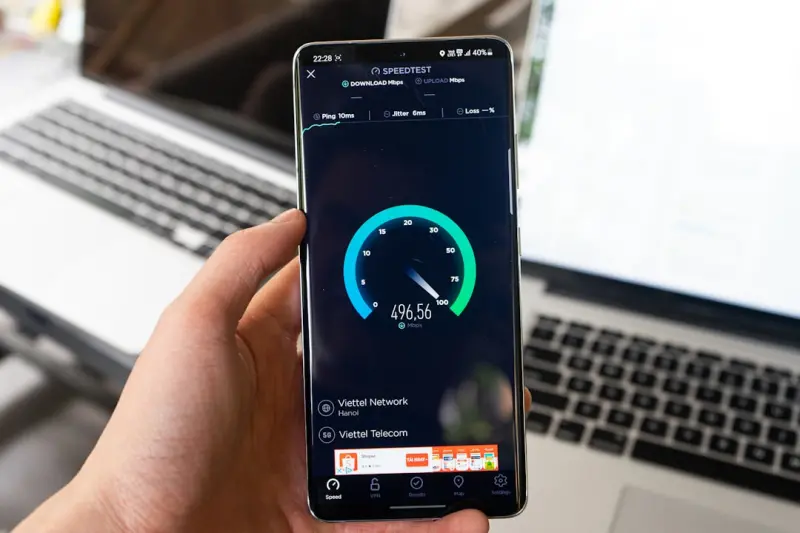
Sensors, AI, and Offline‑First: Redefining Mobile Web Experiences for SaaS
A fresh look at mobile web development that leverages device sensors, client‑side AI, and offlineâ... Read More
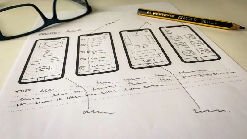
Rethinking Mobile Web Development for B2B SaaS: Edge, PWAs, and WebAssembly
Mobile browsers are now the primary gateway for enterprise users. This post outlines a pragmatic roa... Read More
Top Posts

Why a VPS Is the Ideal Sandbox for SaaS MVPs
A VPS gives founders the isolation, flexibility, and budget certainty needed to launch and iterate on SaaS MVPs, while still allowing easy migration as the prod...Read More

Why Accessibility Should Lead Mobile Web Development for SaaS
Putting accessibility at the forefront of mobile web development not only fulfills legal obligations but also expands market reach, boosts SEO, reduces support ...Read More

Why Theme Modularity is the Secret Sauce for Modern WordPress Sites
Modular WordPress themes break the monolithic template into interchangeable components, delivering faster load times, better accessibility, and brand consistenc...Read More

Bootstrap’s Quiet Renaissance: A SaaS Engineer’s Playbook
Bootstrap has quietly evolved into a modern design‑system engine. This post shows SaaS engineers how to harness its new flex grid, utility API, and dark‑mod...Read More
0 Comments
Post Comment
You will need to Login or Register to comment on this post!