
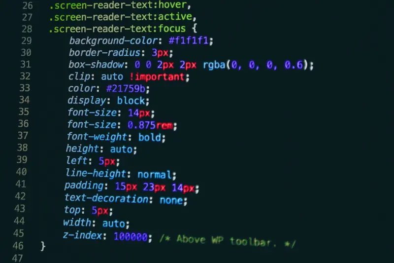
Why the Bootstrap Utility API Is a Game‑Changer for SaaS Design Systems
When I first started stitching together UI components for a SaaS dashboard, I treated Bootstrap like a toolbox – a place to grab a button, a grid, and a modal, then patch them together with custom CSS. Over time, I realized I was missing a deeper conversation: how can Bootstrap help us build a truly scalable design system? The answer lies in the Utility API, a set of low‑level classes that let you compose styles directly in your markup, keeping design intent visible where it matters most: the HTML.
In this post I’ll walk through the practical steps of turning the Utility API into the backbone of a SaaS design system, show you how it meshes with modern theming workflows, and explain why this approach saves engineering time, reduces CSS bloat, and guarantees visual consistency across every product line.
From “Bootstrap as a SaaS Prototyping Powerhouse” to Production‑Ready Systems
Many of us have read the Bootstrap as a SaaS Prototyping Powerhouse article and used the framework to spin up quick wireframes. Prototyping is valuable, but the real challenge is migrating those mock‑ups into a maintainable, production‑grade design system. The Utility API is the bridge that takes you from “quick mock” to “engineered UI”.
Utility API Basics – What You Need to Know
- Atomic classes: Think of each utility as an atom –
.p-3for padding,.text-centerfor alignment,.bg-primaryfor background color. - Responsive variants: Append breakpoints (
-sm,-lg) to adapt styles without writing media queries. - Custom properties: Bootstrap 5 exposes CSS variables (e.g.,
--bs-primary) that you can tweak in your theme file, instantly cascading changes. - Composable syntax: Stack utilities on a single element to express layout, spacing, color, and typography in one line of HTML.
When you start thinking in terms of these building blocks, you stop fighting the CSS cascade and start directing it.
Step‑by‑Step: Building a SaaS Design System with Utilities
1. Define Your Brand Tokens
Everything begins with a token map. Open scss/_variables.scss (or your preferred SCSS entry point) and replace Bootstrap’s defaults with your brand colors, font families, and sizing scale.
$primary: #1E88E5;
$secondary: #6C757D;
$font-base: 'Inter', sans-serif;
$spacing-unit: 0.5rem;
Because the Utility API references these tokens via CSS variables, updating a token automatically updates every .bg-primary, .text-secondary, and .gap-3 in your UI.
2. Create Semantic Utility Classes
Bootstrap ships with a robust set, but SaaS products often need domain‑specific helpers. Extend the API in scss/_utilities.scss:
@utility "status" {
  property: color;
  class: .status;
  values: (
    success: $green-600,
    warning: $orange-600,
    error: $red-600,
  );
}
Now you can tag a status badge with <span class="status-success">Active</span> and keep the markup self‑documenting.
3. Enforce Consistency with Linting Rules
Introduce a stylelint rule that flags any custom CSS that could be expressed with a utility. This nudges developers toward the utility‑first approach, preventing divergent styles from creeping in.
4. Document the System in a Living Style Guide
Use a static site generator (e.g., Storybook, Docusaurus) to showcase each utility. Pair live code examples with a description of when to use .p-2 vs. .px-3. This documentation becomes the single source of truth for product designers and engineers alike.
5. Integrate with Component Libraries
When you wrap utilities inside reusable React or Vue components, you get the best of both worlds: declarative component APIs and the flexibility of utility classes. For instance, a Button component can accept a variant prop that maps to a set of utility classes:
function Button({variant = "primary", size = "md", children}) {
  const classes = `
    btn
    ${variant === "primary" ? "bg-primary text-white" : "bg-light text-dark"}
    ${size === "sm" ? "py-1 px-2" : "py-2 px-3"}
  `;
  return <button className={classes}>{children}</button>;
}
This pattern keeps the component thin while still leveraging the power of the Utility API.
Utility API vs. Traditional CSS Architecture
Traditional CSS architectures—BEM, OOCSS, SMACSS—encourage naming conventions to manage specificity. The Utility API flips that script: you don’t name; you compose. Below is a quick comparison:
| Approach | Pros | Cons |
|---|---|---|
| BEM | Clear hierarchy, scalable naming | Verbosity, CSS file bloat, learning curve |
| Utility API | Fast iteration, minimal CSS, consistent tokens | Initial mental shift, potential HTML clutter |
For SaaS teams that ship features weekly, the speed gained from utilities often outweighs the minor trade‑offs of more verbose markup.
Responsive Design Made Simple
One of the most frustrating parts of building SaaS dashboards is juggling media queries across dozens of components. Bootstrap’s responsive utilities let you embed breakpoint logic directly:
<div class="d-flex flex-column flex-lg-row gap-3">
  <aside class="w-100 w-lg-25">…</aside>
  <main class="flex-grow-1">…</main>
</div>
Notice how the same element adapts from a vertical stack on mobile (flex-column) to a horizontal layout on larger screens (flex-lg-row) without a single line of custom media query code.
Future‑Proofing with CSS Container Queries
Container queries will soon let you apply utilities based on the size of a parent component rather than the viewport. Pairing this upcoming feature with the Utility API means you can build truly modular cards that automatically reflow when placed in different contexts—perfect for SaaS marketplaces where the same product tile appears in a list, a carousel, or a modal.
Case Study: Scaling a Multi‑Tenant SaaS Platform
Our team at DataPulse (a fictional analytics SaaS) faced a common dilemma: each tenant demanded a slightly different color palette while the core UI remained identical. By leveraging the Utility API’s token system, we introduced a $brand-primary variable per tenant at runtime. The server rendered a small CSS payload that overwrote the default tokens, and every utility class instantly reflected the tenant’s brand.
- Result: Zero duplicate component code.
- Speed: Theme switch took under 100 ms on the client.
- Maintenance: One source of truth for spacing, typography, and color.
This approach would have been impossible with a classic BEM‑based CSS hierarchy that required separate style sheets for each tenant.
Integrating with Low‑Code Workflows
Many SaaS businesses now empower non‑technical staff to assemble internal tools using low‑code platforms. The Utility API dovetails nicely: drag‑and‑drop builders can expose a palette of utility classes as toggle options. A marketing manager can change a button’s spacing from .py-2 to .py-3 with a single click, and the change propagates instantly across every page that uses the component.
Because utilities are declarative, they translate cleanly into JSON schemas that low‑code engines consume, preserving design fidelity without hand‑coded CSS.
Best Practices & Gotchas
- Keep HTML readable: Group related utilities with line breaks or comments for long class strings.
- Avoid over‑specificity: Rely on utilities first; fall back to custom CSS only for truly unique cases.
- Version control your token file: Treat
_variables.scssas the contract between design and engineering. - Test across browsers: While modern browsers handle utilities flawlessly, older corporate environments may still need fallbacks.
Conclusion – The Utility API as a Strategic Asset
Bootstrap’s Utility API isn’t just a set of convenience classes; it’s a strategic asset that aligns design intent, engineering velocity, and product scalability. By treating utilities as the lingua franca of your SaaS UI, you empower teams to iterate faster, reduce CSS debt, and deliver a consistent experience across every tenant, device, and channel.
Give it a try on your next feature sprint. You’ll be surprised at how quickly your design system gains clarity, and how much less time you spend hunting down obscure CSS overrides. In the fast‑moving world of SaaS, that kind of efficiency is the real competitive edge.

Brian LeBlanc is a front-end web developer, UX designer, and web application developer with experience building scalable, user-friendly digital solutions.Holding a degree from University, he specializes in leveraging a wide array of modern languages, frameworks, and tools—such as JavaScript/ES6, HTML5/CSS3, PHP, and responsive interface design—to create efficient applications that simplify user experiences.
Related Posts
Bootstrap’s Secret Sauce for Scalable SaaS Front‑Ends
Bootstrap isn’t just a starter kit; when customized with a brand‑centric theme, utility API, and... Read More

Turning Bootstrap Into a SaaS Utility Engine
Learn how Bootstrap’s modern utility‑first approach can accelerate SaaS UI development, keep des... Read More

Dark Mode Mastery: Turning Bootstrap into a Dynamic Theming Engine for SaaS
A practical walkthrough shows how to use CSS custom properties, container queries, and design tokens... Read More
Top Posts
Why Accessibility‑First WordPress Themes Are a Game‑Changer for SaaS
An accessibility‑first WordPress theme not only meets WCAG standards but also improves SEO, reduces legal risk, and drives higher conversions for SaaS busines...Read More

Why jQuery Still Matters for Modern Web Apps
jQuery may seem outdated, but it still offers a lightweight, reliable bridge for legacy SaaS interfaces, rapid prototyping, and seamless integration with modern...Read More

Micro‑Frontends: Unlocking Agility and Scale in Modern Web Development
Micro‑frontends break monolithic UIs into independent, deployable fragments, giving teams autonomy, faster releases, and improved performance—learn the why,...Read More

Shared Hosting as a Launchpad: When to Leverage, Optimize, and Scale
Shared hosting offers a low‑cost entry point for SaaS startups. Learn how to squeeze performance, secure your site, and spot the signs that it’s time to mig...Read More
0 Comments
Post Comment
You will need to Login or Register to comment on this post!