
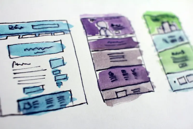
Why Design Tokens Are the Unsung Heroes of Scalable SaaS Web Design
When I first cut my teeth on web projects, I spent more time arguing over whether a button should be flat or skeuomorphic than I did thinking about how those choices would survive a product’s growth spurt. Fast‑forward a few releases, a handful of product pivots, and a mountain of feature flags, and you’ll find that the real battle is keeping the visual language consistent across dozens of micro‑frontends, brand‑new marketing pages, and a never‑ending stream of A/B tests.
Enter design tokens—the tiny, atomic pieces of a visual system that can be shared, versioned, and, most importantly, code‑driven. Think of them as the DNA of your UI: a single source of truth for colors, spacing, typography, and motion that can travel from Sketch or Figma straight into your CSS, JavaScript, and even native mobile apps. When used correctly, they turn the chaotic “design‑by‑hand” process into an efficient, repeatable pipeline that scales with your business, not against it.
Design Tokens vs. Traditional Style Guides: The Evolution
Style guides have been the go‑to reference for designers and developers for years. They’re great for documentation but quickly become outdated the moment a designer tweaks a shade of blue or adds a new spacing token. Tokens, on the other hand, live in a version‑controlled repository. They’re modern CSS techniques in action—variables that can be consumed by a preprocessor, a design tool, or a runtime theme engine.
- Single source of truth: One JSON or YAML file, one source of truth, and you eliminate the “my button looks different on page X” nightmare.
- Programmable consistency: Tokens can be transformed at build time. Need a dark mode? Just swap out a token file.
- Cross‑platform synergy: The same token set can power your web, iOS, Android, and even email templates.
Building a Token‑First Workflow
Adopting tokens isn’t just about swapping out a variables.scss file. It requires a cultural shift that brings designers, developers, and product managers into a shared loop. Here’s a high‑level playbook I’ve refined over the past few product cycles:
- Define the core palette: Start with brand colors, then derive semantic roles (primary, secondary, error, success). Keep the palette small—usually five to seven base hues—and let tints/shades be generated algorithmically.
- Set spacing and sizing scales: Adopt a modular scale (e.g., 4‑8‑16‑32) and expose each step as a token. This prevents “random padding” from creeping into the codebase.
- Capture typography: Tokenize font families, weights, line‑heights, and letter‑spacing. When a new typeface is approved, you only update the token file.
- Document motion: Even easing curves and animation durations belong in the token map. Consistent motion builds a cohesive brand feel.
- Integrate with design tools: Plugins for Figma, Sketch, or Adobe XD can import/export token files, ensuring designers work with the same values they’ll see in code.
- Automate the pipeline: Use a build step (Webpack, Vite, or even a custom Node script) to convert tokens into CSS custom properties, SCSS variables, and JSON for the front‑end framework of choice.
How Tokens Play Nice with Performance Metrics
One of the biggest objections I hear is “Will this add latency to our front‑end?” The answer is a confident “No.” Since tokens are compiled into static assets, they don’t add runtime overhead. In fact, they can Web Vitals improvements by reducing CSS bloat and making critical CSS extraction cleaner. When your token set is lean, the resulting CSS is smaller, and the browser can paint faster.
Additionally, because tokens enable easy theming, you can serve a single CSS bundle with CSS custom properties that switch on the fly. This eliminates the need for separate stylesheet files per theme, cutting down on HTTP requests—a direct win for LCP (Largest Contentful Paint) and CLS (Cumulative Layout Shift).
Design Ops: The Organizational Glue
Design tokens don’t exist in a vacuum; they need a governance model. That’s where Design Ops steps in. Much like DevOps for engineers, Design Ops provides the processes, tooling, and rituals that keep the visual system healthy:
- Versioning strategy: Treat token files as code—use semantic versioning, pull requests, and code reviews.
- Change impact analysis: When a token changes, run automated visual regression tests across a suite of UI snapshots.
- Cross‑team communication: Create a “token change log” that notifies front‑end, mobile, and marketing teams of upcoming updates.
- Governance board: A small committee of designers, developers, and product leads decides when to introduce new tokens or deprecate old ones.
By formalizing these practices, you prevent the “design debt” that accumulates when UI tweaks are made ad‑hoc. The result? A visual system that can evolve without breaking the user experience.
Case Study: Scaling a Multi‑Tenant SaaS Platform
Let’s walk through a concrete example. My team was tasked with revamping the UI for a B2B analytics platform that served three distinct customer tiers, each with its own branding overlay. Previously, each tier had a separate stylesheet with duplicated rules, leading to a 150KB CSS bundle per page.
We introduced a token‑first approach:
- Extracted the core brand palette into a
tokens/base.jsonfile. - Created tier‑specific token extensions (e.g.,
tokens/tier‑gold.json) that only override the primary color and logo. - Configured a build script that merges the base tokens with the selected tier tokens at compile time, outputting a single
theme.cssper tier. - Implemented a runtime switch that loads the appropriate
theme.cssbased on the tenant’s subdomain.
The results were striking:
- CSS size reduced from 150KB to under 45KB per page—a 70% decrease.
- First Contentful Paint (FCP) improved by 350ms across all tiers.
- Design updates, like a new accent color, rolled out in minutes instead of days because only the token file needed a change.
This experience reinforced my belief that tokens are not a “nice‑to‑have” luxury; they’re a must‑have for any SaaS product that aspires to grow without drowning in UI inconsistency.
Integrating Tokens with Component Libraries
If you’ve invested in a component library—React, Vue, or Web Components—you already have a natural hook for tokens. Expose token values as props or context values, and let each component read from them. For example, a <Button> component could accept a variant prop that maps to a token set defining background, border, and hover states.
When you pair this with a theming solution like styled-components or CSS Modules, the component library becomes a living embodiment of your design system. Any change to a token instantly propagates through the UI, and because the components are isolated, you maintain a clean separation of concerns.
Common Pitfalls and How to Avoid Them
Even the most enthusiastic token adopters can trip over a few traps:
- Over‑tokenization: Not every pixel needs a token. Start small—focus on colors, spacing, and typography first.
- Neglecting naming conventions: Use clear, hierarchical names like
color.brand.primaryorspacing.4. Ambiguous names lead to misuse. - Forgetting accessibility: Ensure color tokens meet contrast ratios. Include tokens for focus outlines and error states.
- Skipping testing: Visual regression testing is non‑negotiable. A single token change can ripple across dozens of components.
- Isolating designers from token updates: Keep the design tool plugins in sync, so designers see the same values they’ll see in the final product.
Future‑Proofing Your Visual System
Design tokens are already gaining traction in the broader web community, with initiatives like the design system fundamentals movement pushing for standardization. As browsers continue to support CSS custom properties natively, and as design tools deepen their token integration, the barrier to entry will keep falling.
Looking ahead, I see three trends shaping token‑centric web design:
- Dynamic token generation at runtime: Services that calculate contrast‑aware colors on the fly for user‑generated themes.
- Cross‑domain token registries: Public token repositories that let companies share base palettes while still extending them privately.
- AI‑assisted token suggestions: Machine‑learning models that propose token values based on brand guidelines, reducing manual iteration.
By embracing tokens now, you’ll be well‑positioned to leverage these innovations without a massive overhaul.
Takeaway: Start Small, Think Big
Design tokens might feel like a modest addition—a JSON file, a few lines of SCSS—but they unlock a cascade of benefits that ripple through performance, maintainability, and brand cohesion. The journey begins with a single token map, but the destination is a truly scalable visual system that can keep pace with product growth, feature velocity, and evolving brand narratives.
If you’re ready to bring token‑driven design into your SaaS product, start by auditing your current style guide, extract the top five visual primitives, and set up a version‑controlled token repo. From there, let your design and engineering teams collaborate on the first pull request, and watch the magic happen.

Dale Peterson is a freelance writer with a passion for technology, travel, law and personal finance. With 10 years of experience crafting compelling and informative content, he's dedicated to delivering high-quality writing for Blogging Fusion that engages audiences and achieves specific goals.
Related Posts
Design Systems & Micro‑Interactions: Crafting Consistent Enterprise Web Experiences
A deep dive into building a living design system and intentional micro‑interactions that unify fra... Read More
Variable Fonts and Fluid Typography: Redefining Web Design in SaaS
Variable fonts transform static typography into a dynamic, performance‑driven tool. This post expl... Read More

Designing SaaS Interfaces That Adapt: From Tokens to Real‑Time Feedback
A deep dive into adaptive web design for SaaS, covering token-driven theming, real‑time UI mutatio... Read More
Top Posts

Unlocking the Full Potential of a VPS for Scalable SaaS Operations
A deep dive into turning a simple VPS into a robust, scalable, and secure foundation for SaaS, covering performance tuning, security hardening, cost optimizatio...Read More

Event‑Driven Full‑Stack: Turning Asynchrony into Business Agility
Discover why treating events as the core communication primitive unlocks loose coupling, faster iteration, and real‑time analytics, and get a practical migrat...Read More

Why Drupal Is the Unsung Hero for AI‑Driven Content Automation
Explore how Drupal’s decoupled architecture, robust access control, and rich ecosystem enable seamless AI‑driven content generation and automation, deliveri...Read More
Rethinking Mobile Web Development for B2B SaaS: Edge, PWAs, and WebAssembly
Mobile browsers are now the primary gateway for enterprise users. This post outlines a pragmatic roadmap that leverages edge functions, progressive web apps, an...Read More
0 Comments
Post Comment
You will need to Login or Register to comment on this post!