
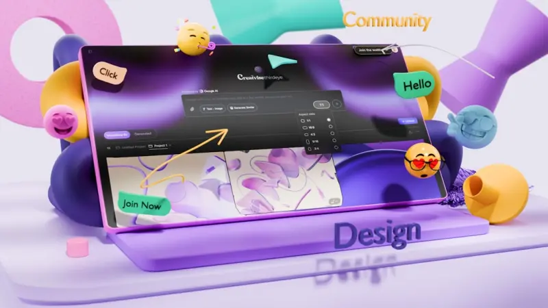
When I first started sketching wireframes on a whiteboard, the mantra was simple: “Make it beautiful and usable.” Fast forward a few iterations of the web, and the conversation has evolved into something far more nuanced. Today’s SaaS products must not only look good—they need to anticipate user intent, adapt in real‑time, and respect the growing demand for privacy and accessibility. In this post I’m pulling back the curtain on a design philosophy that’s quietly reshaping the industry: AI‑driven personalization built on a foundation of design tokens, motion restraint, and a rigorous design‑ops workflow.
Why AI Personalization Isn’t Just a Fancy Add‑On Anymore
Artificial intelligence is no longer a buzzword reserved for data scientists. Modern front‑ends can query a user’s historical behavior, context, and even device capabilities in milliseconds, delivering UI variants that feel handcrafted. The payoff? Higher conversion rates, reduced churn, and a perception of “the product just gets me.” But this power comes with responsibility—designers must guard against the “filter bubble” effect and ensure that any AI‑generated UI remains inclusive and transparent.
Design Tokens: The DNA of Scalable UI
Before you can hand AI a palette of UI options, you need a single source of truth for every visual property. Enter design tokens—atomic values for colors, spacing, typography, and shadow that live in a JSON file and get compiled into CSS variables, Swift constants, or Android resources. This approach does three things:
- Consistency: Every component, from a modal to a tooltip, draws from the same token set, eliminating visual drift.
- Speed: When the brand decides to tweak the primary hue, a single token change ripples across the entire product in seconds.
- AI Compatibility: Tokens provide a structured language for machine‑learning models to understand design constraints, making it easier to generate valid UI variations.
If you’re still using scattered SCSS variables, consider migrating to a token system. The effort pays off quickly, especially when you start feeding those tokens into personalization engines.
Motion Discipline: When Animation Becomes a UX Liability
There’s a fine line between delightful motion and a performance nightmare. AI can suggest “add a subtle slide‑in for newly loaded cards,” but if every interaction is animated, you’ll burn CPU cycles, increase battery drain, and frustrate users with reduced accessibility. Here’s a checklist I use when evaluating motion proposals:
- Purpose‑First: Does the animation communicate state, hierarchy, or feedback? If not, cut it.
- Duration & Easing: Stick to 150‑300 ms for most UI transitions; use cubic‑bezier curves that feel natural.
- Reduce Motion Settings: Respect the operating system’s
prefers-reduced‑motionmedia query. Always provide a fallback. - Performance Budget: Keep total animation‑related paint time under 16 ms per frame to stay at 60 fps.
By codifying these rules in a design system, you give AI a guardrail that prevents it from “over‑animating” the experience.
Accessibility as a Personalization Pillar
Personalization often focuses on visual or content tweaks, but accessibility is an equally powerful lever. Imagine a SaaS dashboard that automatically switches to a high‑contrast theme for users with low vision, or expands hit‑targets when it detects a user is on a touch‑only device. AI can infer these needs from telemetry—like frequent zoom actions or keyboard navigation patterns—and surface the appropriate UI configuration.
Key steps to embed accessibility into your AI loop:
- Gather anonymized interaction data (mouse vs. keyboard vs. touch).
- Tag UI components with ARIA roles and landmark information in your token schema.
- Train models to map interaction patterns to accessibility settings (e.g., font size, contrast).
- Provide a transparent toggle so users can override AI decisions.
Design‑Ops: The Glue That Holds Everything Together
All the tokens, AI pipelines, and accessibility rules are useless without a disciplined design‑ops process. Here’s my “four‑phase” workflow that scales across product teams:
- Discovery & Tokenization: Capture brand guidelines and translate them into a token library. Store this library in a version‑controlled repo.
- Component Library Build: Create reusable UI components (buttons, tables, charts) that consume tokens. Publish them to a private NPM registry or a design‑system hub.
- AI Model Integration: Hook the component library into a personalization engine that selects token overrides based on user context.
- Continuous Validation: Use automated visual regression tests, Lighthouse performance audits, and accessibility scans to ensure every AI‑generated variant passes quality gates before release.
When done right, design‑ops transforms a chaotic collection of UI experiments into a predictable, measurable pipeline. It also makes it easier to justify investments in AI because you can trace outcomes back to concrete design decisions.
Case Study: From Static Dashboard to Adaptive Experience
One of our SaaS clients—an analytics platform for mid‑size enterprises—was struggling with low adoption of its reporting module. The UI was a one‑size‑fits‑all grid that felt overwhelming to new users and under‑utilized by power users. We applied the principles outlined above:
- Built a token set that defined three visual density levels: compact, balanced, and spacious.
- Created a component library for tables, filters, and charts that accepted density tokens as props.
- Trained a lightweight decision tree that examined the user’s session length, feature usage, and device type to predict the optimal density.
- Implemented a feature flag that allowed us to A/B test the adaptive UI against the static baseline.
The result? A 22 % lift in feature engagement and a 15 % reduction in bounce rate on the reporting page. Importantly, users reported feeling “more in control” of their workspace, which reinforced the brand’s promise of “empowering data‑driven decisions.”
Future‑Proofing: Preparing for the Next Wave of UI Evolution
While AI is the current frontier, the web is on the cusp of another paradigm shift: native browser extensibility through CSS Houdini and Web Components. These technologies will let designers inject custom layout engines and paint worklets directly into the rendering pipeline, opening the door for hyper‑personalized experiences that run at 60 fps without JavaScript bloat.
To stay ahead, I recommend:
- Experimenting with container queries to make components truly context‑aware.
- Adopting a modular component architecture reminiscent of micro frontends, but at the UI level—think “micro widgets” that can be swapped out by an AI engine.
- Investing in tooling that can capture design intent as code (e.g., Figma plugins that export token‑ready JSON).
Putting It All Together: A Checklist for Teams Ready to Embrace AI‑First Design
- Define a token strategy: Colors, spacing, typography, motion, and accessibility settings all live in a shared schema.
- Build reusable components: Ensure every UI piece reads from tokens and respects motion budgets.
- Integrate AI responsibly: Use transparent models, provide user overrides, and monitor for bias.
- Embed accessibility early: Treat it as a core personalization dimension, not an afterthought.
- Establish design‑ops: Version‑control tokens, automate testing, and enforce quality gates.
- Plan for future APIs: Stay informed about CSS Houdini, container queries, and Web Component standards.
By weaving these threads together, you’ll create SaaS experiences that feel handcrafted for each individual user—without the endless manual labor that traditionally plagued UI teams. The future of web design isn’t about replacing designers with algorithms; it’s about augmenting our creative instincts with data‑driven precision, allowing us to spend more time on strategy and less on repetitive tweaks.

Dale Peterson is a freelance writer with a passion for technology, travel, law and personal finance. With 10 years of experience crafting compelling and informative content, he's dedicated to delivering high-quality writing for Blogging Fusion that engages audiences and achieves specific goals.
Related Posts

The Quiet Revolution of Ethical Web Design: Balancing Beauty, Speed, and User Trust
A deep dive into ethical web design, showing how transparent intent, performance‑first mindset, an... Read More
Why Every SaaS Needs a Design System for Web Success
A design system is the backbone of scalable SaaS web interfaces, uniting visual consistency, develop... Read More
Design Systems & Micro‑Interactions: Crafting Consistent Enterprise Web Experiences
A deep dive into building a living design system and intentional micro‑interactions that unify fra... Read More
Top Posts

Unlocking Global Scale: Multi‑Region Deployments with Node.js
This article explains why multi‑region deployments are essential for modern Node.js SaaS, outlines architectural patterns, and provides a step‑by‑step gui...Read More

Bootstrap’s Quiet Revolution: From Boilerplate to Brand‑Centric Design System
Bootstrap has evolved from a simple grid to a powerful design‑system engine. Learn how to use its utility API, CSS variables, dark‑mode support, and WebAsse...Read More

Edge‑First Web Development: How to Build SaaS Front‑Ends That Live at the Edge
Edge‑first web development moves compute to the global network, slashing latency, tightening security, and accelerating releases. Learn why SaaS teams should ...Read More

Managed WordPress Hosting: The Unsung Catalyst for B2B Scale
Managed WordPress hosting offers elastic architecture, Git‑based deployments, and enterprise‑grade security, turning a simple CMS into a strategic growth en...Read More
0 Comments
Post Comment
You will need to Login or Register to comment on this post!