
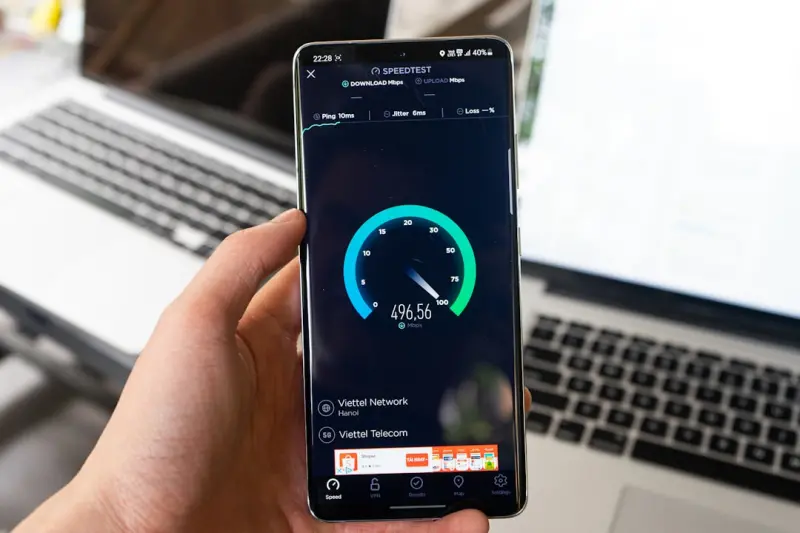
Why Mobile Web Should Be Thought of as a Living, Learning Interface
When I first cut my teeth on native‑only mobile strategies, the rule‑book was simple: build once, ship fast, pray the user doesn’t notice the constraints. Those days feel distant now, not because the devices are less capable, but because the expectations have morphed. Mobile browsers have become a sensor‑rich, AI‑enabled playground where every tap, swipe, and even ambient sound can inform a personalized experience. In my world of SaaS, the mobile web is no longer a “fallback” to an app; it’s a living interface that evolves with each interaction.
Sensor‑Driven Interactions: Turning Phones Into Contextual Assistants
Modern smartphones expose a plethora of sensors—accelerometer, gyroscope, ambient light, proximity, and even barometric pressure. Historically, SaaS products ignored these data streams, focusing solely on form inputs and clicks. That’s a missed opportunity. Imagine a project‑management dashboard that subtly adjusts its UI density based on whether the user is walking, on a train, or sitting at a desk. The accelerometer can detect motion, prompting the UI to switch to a simplified “focus mode” with larger touch targets when the device is in motion.
Implementing this doesn’t require a rewrite in native code. The DeviceOrientationEvent and AmbientLightSensor APIs are now stable across the major browsers. Pair them with a lightweight state machine (think Bootstrap Utility API concepts) to toggle CSS classes that drive the UI changes. The result is a web experience that feels as responsive and context‑aware as a native app, without the friction of app store approvals.
AI‑Powered Personalization at the Edge
Artificial intelligence has graduated from server‑side recommendation engines to real‑time, on‑device inference. TinyML models can run in the browser, leveraging WebGL and WebGPU for accelerated compute. For a SaaS analytics platform, this opens the door to instant anomaly detection on the client: a model trained on historical usage patterns can flag outliers the moment a user opens a chart, all without a round‑trip to the server.
The key is to keep the model size under 100 KB and to load it lazily. WebAssembly shines here, providing near‑native performance for inference while keeping the JavaScript bundle lean. By offloading these calculations to the client, you reduce latency, lower server load, and—crucially—respect user privacy, because sensitive data never leaves the device.
Offline‑First Design: Trusting the Browser’s Cache
Service workers have been around long enough that “offline‑first” is no longer a buzzword; it’s a reliability requirement. SaaS teams often assume their customers will always have a stable connection, but the reality is a patchwork of cellular dead zones and corporate firewalls. An offline‑first mobile web app ensures that critical workflows—like submitting a support ticket or approving a transaction—remain usable when the network sputters.
The pattern I advocate is simple:
- Cache the UI shell during the first visit using
workbox‑precaching. - Store mutable data locally with IndexedDB, syncing back when connectivity returns.
- Provide visual cues (e.g., a subtle banner) that indicate the app is operating in offline mode.
When combined with progressive enhancement, this approach gracefully degrades: users on low‑end devices still get the core experience, while power users enjoy a seamless, always‑available interface.
Design Systems Meet Mobile Constraints
Design systems have become the backbone of scalable SaaS UI teams, yet many struggle to translate them to the mobile web’s fluid constraints. The trick is to think in tokens that adapt, not static values. For instance, instead of a fixed 16 px margin, define a spacing‑unit that scales with the viewport width using calc(var(--base‑spacing) * 1vw). This ensures consistency across devices while honoring the design system’s intent.
Integrating these tokens into a component library (React, Vue, or Svelte) allows developers to reference them directly, avoiding magic numbers. The result is a UI that feels cohesive whether the user is on a 5‑inch phone or a 7‑inch foldable. For deeper insights on the role of design systems in SaaS, see Why Design Systems Are the Unsung Heroes of Modern SaaS Web Design.
Performance Hygiene: Beyond the “Fast Load” Checklist
Traditional performance metrics—Time to First Byte, First Contentful Paint—are still important, but they don’t capture the nuance of mobile interactions. On a pocket‑sized device, interaction latency (the delay between a tap and the UI response) feels more jarring than a slightly slower initial load.
Here are three practices that specifically target mobile interaction latency:
- Prioritize main‑thread work: Use
requestIdleCallbackfor non‑critical tasks, keeping the main thread free for user input. - Leverage CSS containment: Applying
contain: layout paint style;to components prevents unnecessary layout thrashing. - Adopt “partial hydration”: Instead of hydrating the entire page, hydrate only interactive components, reducing JavaScript execution time.
Combine these with the sensor‑driven and AI‑enhanced features described earlier, and you end up with a mobile web experience that feels both snappy and intelligent.
Testing Mobile Web at Scale
Testing is where many SaaS teams stumble. Emulators are great for quick checks, but they don’t reflect real‑world network variability or hardware sensor fidelity. My approach is a three‑layered strategy:
- Unit tests for pure JavaScript logic, especially AI inference functions.
- Component tests using tools like Cypress that can simulate device orientation, geolocation, and offline states.
- Real‑device cloud testing (BrowserStack, Sauce Labs) to validate sensor APIs and performance under throttled networks.
Automation scripts should also record PerformanceObserver entries, feeding data back into a dashboard that flags regressions in interaction latency before they reach customers.
Future‑Proofing: Embracing the “Web‑First” Paradigm
Looking ahead, the line between native and web will blur further. The upcoming WebXR APIs promise immersive experiences directly in the browser, and the Web NFC spec will let SaaS products read near‑field communication tags without a native bridge. By building on open web standards today—sensor APIs, Service Workers, WebAssembly—you set a foundation that can absorb these future capabilities with minimal friction.
In practice, this means:
- Architecting your codebase around capability detection rather than device detection.
- Keeping bundles modular so new APIs can be dropped in as optional enhancements.
- Maintaining a strong design system that can accommodate novel interaction patterns without breaking visual consistency.
The payoff is a mobile web product that not only meets today’s expectations but also evolves gracefully as the platform itself matures.
Closing Thoughts: From “Mobile Web” to “Mobile Experience”
For SaaS teams, the real competitive edge isn’t faster load times or prettier UI; it’s the ability to understand the user’s context and react in real time—all within the browser. By tapping into device sensors, running AI locally with WebAssembly, and designing with an offline‑first mindset, you transform a traditional mobile website into an adaptive, intelligent companion.
If you’re ready to start this journey, begin by auditing your current stack for sensor support, experiment with a tiny TensorFlow.js model, and set up a service worker that syncs critical data. The pieces are already out there; it’s a matter of stitching them together with a design system that respects mobile constraints. The mobile web is no longer a second‑class citizen—it’s the front line of user engagement, and it’s waiting for you to claim it.

Brian LeBlanc is a front-end web developer, UX designer, and web application developer with experience building scalable, user-friendly digital solutions.Holding a degree from University, he specializes in leveraging a wide array of modern languages, frameworks, and tools—such as JavaScript/ES6, HTML5/CSS3, PHP, and responsive interface design—to create efficient applications that simplify user experiences.
Related Posts

Reinventing Mobile Web Development with Edge‑Driven Micro‑Interactions
Discover a fresh approach to mobile web development that leverages edge computing for instant microâ... Read More

WebAssembly & Edge: Future‑Proofing Mobile Web
WebAssembly and edge computing together unlock native‑like speed, on‑device AI, and secure proce... Read More

Adaptive Mobile Web: From Context‑Aware Assets to Edge‑Driven Personalization
Explore a practical framework for adaptive mobile web development that combines context‑aware asse... Read More
Top Posts

Refactoring Legacy jQuery: A Pragmatic Roadmap for Modern SaaS Teams
Discover a practical, incremental strategy to audit, test, modularize, and replace legacy jQuery code, turning technical debt into a competitive advantage for m...Read More

Server‑Driven UI: Redefining Mobile Web Experiences
Server‑driven UI shifts UI logic to the backend, enabling context‑aware, lightweight mobile web experiences. Learn practical steps, performance tips, and ro...Read More

Why AI‑Powered Incident Response Is the Next Evolution in DevOps
AI‑powered incident response transforms DevOps from reactive firefighting to proactive, automated healing. Learn the steps to integrate AI, track ROI, and avo...Read More

Compliance‑First Dedicated Server Strategy: Turning Regulation into Advantage
Discover a step‑by‑step guide to building a compliance‑first dedicated server environment that meets strict regulations, reduces operational risk, and del...Read More
0 Comments
Post Comment
You will need to Login or Register to comment on this post!