
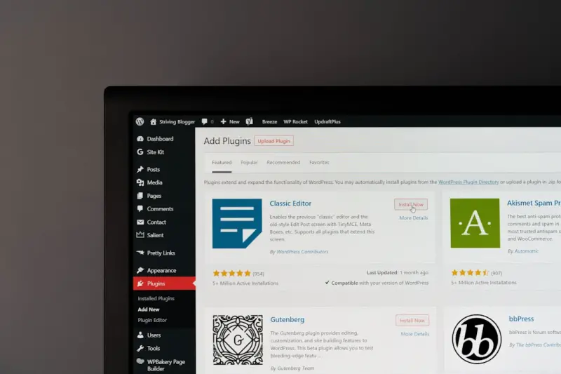
Design Systems Meet WordPress Themes: Scaling Consistency Without Code Chaos
When I first started building sites for clients, I quickly learned that a beautiful design is only half the battle. The other half is maintaining that design across dozens of pages, dozens of client revisions, and, eventually, new product lines. That’s why I’ve been obsessed with the idea of treating a WordPress theme as a living design system—a reusable, modular collection of UI patterns, style tokens, and interaction guidelines that can evolve without breaking the user experience.
Most WordPress themes on the market today are still built around the classic “one‑off” template approach: a handful of PHP files, a monolithic stylesheet, and a sprinkling of customizer options. It works for a single‑page brochure site, but as the site grows, the codebase becomes a tangled web of overrides, inline styles, and ad‑hoc hacks. The result? Slower performance, higher maintenance costs, and a design that drifts away from the original vision.
This post is a deep dive into how you can bring the rigor of a design system into the WordPress ecosystem, why it matters for agencies and SaaS providers, and the concrete steps you can take today to future‑proof your themes.
Why a Design System Is Not Just a Fancy Word
At its core, a design system is a shared language between designers, developers, and product managers. It defines:
- Foundations – colors, typography, spacing, and motion that create visual harmony.
- Components – reusable UI blocks like buttons, cards, modals, and navigation menus.
- Patterns – higher‑level constructs such as search experiences, onboarding flows, and error handling.
- Guidelines – rules for accessibility, branding, and interaction that keep everyone aligned.
When these elements live inside a WordPress theme, you get three immediate benefits:
- Consistency at scale. Every new page automatically inherits the same visual DNA, reducing the risk of “brand drift.”
- Speed of iteration. Updating a color token or button state propagates instantly across the entire site, eliminating the need for manual CSS tweaks.
- Developer confidence. Clear component boundaries make it easier for new team members to understand the codebase, cut down onboarding time, and avoid accidental regressions.
Breaking Down the Traditional Theme Stack
Before we rebuild, let’s dissect the classic WordPress theme anatomy. Typically, you’ll find:
- Template files (e.g.,
page.php,single.php) that mix HTML and PHP. - A single stylesheet that grows to thousands of lines as customizations accumulate.
- Theme Customizer settings that store small bits of CSS in the database.
- Optional JavaScript that often lives in a monolithic
main.jsfile.
While this approach is simple to start with, it creates a “spaghetti” architecture where:
- Design changes require hunting for selector specificity battles.
- Component reuse is limited because each template tends to reinvent its own markup.
- Performance suffers as the CSS payload balloons and unused styles remain in the critical path.
In short, the traditional stack is a perfect storm for technical debt.
Re‑architecting a Theme as a Design System
The transformation starts with three pillars: modular CSS, block‑based UI, and data‑driven configuration. Below is a step‑by‑step guide you can follow on any existing theme.
1. Adopt a Utility‑First CSS Framework
Frameworks like Tailwind CSS give you a low‑level set of utility classes that map directly to your design tokens. Instead of writing custom selectors for every button, you apply a handful of classes that represent margin, color, and typography. This approach reduces the CSS footprint dramatically and aligns with the CSS at SaaS Scale: Architecture, Performance, and Future‑Proofing principles—especially the emphasis on atomic styles that can be purged in production.
Implementation steps:
- Install Tailwind via npm and configure
tailwind.config.jswith your brand’s colors, fonts, and spacing scale. - Replace bulky component‑specific rules with utility classes in your templates.
- Use the
@applydirective to compose reusable component classes when you need a semantic name (e.g.,.btn-primary).
2. Leverage the Block Editor (Gutenberg) for UI Components
Gutenberg blocks are the native way to encapsulate UI patterns in WordPress. By building custom blocks that mirror your design system components, you hand over the same building blocks to content editors and developers alike.
Key actions:
- Create a
src/blocks/directory and scaffold blocks using@wordpress/create-block. - Define block attributes that map to design tokens (e.g.,
color,size). - Render block markup with
wp.element.createElement(React) or plain PHP for server‑side rendering, ensuring the output uses your utility classes.
Because blocks are reusable, a “card” component you craft today will be available across every page, post, or custom post type tomorrow—without a single line of additional CSS.
3. Centralize Configuration with JSON Schemas
Design systems thrive on a single source of truth. Store your token definitions (colors, typography, shadows) in a JSON file that both your build pipeline and PHP code can read. For example:
{
  "colors": {
    "primary": "#0066ff",
    "secondary": "#ff6600"
  },
  "spacing": {
    "sm": "0.5rem",
    "md": "1rem",
    "lg": "2rem"
  }
}
During the build step, generate a Tailwind config and a PHP constants file from this JSON. When a designer tweaks a token, the change propagates automatically to both front‑end styles and any server‑side logic that references the token (e.g., inline SVG color fills).
4. Introduce a “Component Library” Plugin
To keep the theme lightweight, package reusable React or Vue components into a companion plugin. This plugin can be activated on any site that uses the theme, offering a clean separation:
- Theme handles layout, routing, and WordPress‑specific hooks.
- Plugin provides the UI component library, enqueues scripts, and registers blocks.
This split mirrors the architecture discussed in Multi‑Tenant SaaS Architecture with Node.js: A Practical Playbook, where core functionality lives in a shared service layer, and each tenant (site) adds its own customization on top.
Performance Gains You Can Measure Right Now
Adopting a design‑system mindset isn’t just a “nice‑to‑have”; it translates into concrete performance wins:
- Reduced CSS payload. By pruning unused utilities with tools like
purgecss, you often shave 30‑50 % off the initial stylesheet size. - Faster paint times. Consistent component markup means the browser can cache layout calculations more efficiently.
- Lower server load. When blocks render server‑side with minimal PHP logic, you avoid the “template cascade” that typically forces multiple DB queries per page.
Combine these gains with a modern hosting stack (e.g., managed WordPress on a fast CDN) and you’ll see Core Web Vitals improve without a major redesign.
Accessibility Becomes Inherent, Not an Afterthought
One of the biggest pitfalls of ad‑hoc theme development is neglecting WCAG compliance. When you codify components, you can bake accessibility checks into each block:
- Buttons automatically receive
aria‑pressedwhen toggled. - Modals enforce focus trapping and restore focus on close.
- Color tokens are vetted for contrast ratios at the token level, ensuring any component that uses
primarymeets AA standards.
Because the rules live in the component definition, every new page that uses the component inherits the same accessibility foundation.
Team Collaboration: Bridging Design and Development
With a design system in place, designers can hand off .figma or .xd files that map directly to component names. Developers then implement those components once, and the system guarantees that the visual intent is preserved. This reduces the “design‑development gap” that often leads to endless revisions.
To make the handoff smoother, consider:
- Maintaining a living style guide site (e.g., Storybook) that showcases every component in isolation.
- Embedding component usage guidelines directly in the WordPress block inspector, so editors see documentation as they edit.
- Running automated visual regression tests on the block output to catch unintended UI drift.
Monetizing a Design‑System‑Powered Theme
If you’re an agency or an independent developer, a robust design system opens new revenue streams:
- Premium component packs. Offer specialized blocks (e.g., pricing tables, testimonial sliders) as add‑ons.
- Subscription updates. Provide ongoing token tweaks, new components, and compatibility patches for a monthly fee.
- White‑label licensing. Allow other agencies to rebrand the system under their own name, expanding your market reach.
Because the architecture is modular, you can ship updates without breaking existing sites—a common pain point in traditional theme marketplaces.
Future‑Proofing: Embracing Headless Possibilities
While the focus of this post is on classic WordPress themes, the same design system can be repurposed for headless deployments. Export your JSON token file and component definitions to a static site generator (e.g., Next.js) or a JAMstack platform, and you’ll have a consistent UI across web, mobile, and even IoT displays.
In practice, this means you can start with a fully‑functional WordPress site, then gradually migrate high‑traffic sections to a headless front end without redesigning the UI. The design system acts as the glue that guarantees visual continuity.
Getting Started: A 30‑Day Sprint
Here’s a practical roadmap to transition an existing theme into a design‑system‑driven powerhouse:
- Week 1 – Audit. Identify all recurring UI patterns (buttons, cards, forms) and extract their markup.
- Week 2 – Tokenize. Create a JSON file for colors, fonts, and spacing. Generate Tailwind config and PHP constants.
- Week 3 – Blockify. Build Gutenberg blocks for the top three patterns. Replace hard‑coded markup in templates with block calls.
- Week 4 – Optimize & Document. Run PurgeCSS, set up a Storybook instance, and write usage guidelines. Deploy to a staging environment for performance testing.
At the end of the sprint, you’ll have a leaner codebase, faster page loads, and a reusable component library that can be shipped to clients as a premium offering.
Conclusion
WordPress themes have evolved from static templates to dynamic experiences. By treating a theme as a design system, you gain consistency, speed, and scalability—all while reducing technical debt and opening new business models. The journey requires a shift in mindset, a few tooling upgrades, and a commitment to documentation, but the payoff is a future‑ready site that can grow with your client’s ambitions.
If you’re ready to start the transformation, begin by mapping your current UI to reusable blocks, adopt a utility‑first CSS workflow, and let the power of a centralized token file drive both design and code. In the weeks to come, you’ll see not just a cleaner theme, but a more collaborative team, happier clients, and a healthier bottom line.

Shawn DesRochers is a certified Microsoft technician and Programmer with 30+ year's experience. He has written many reviews on computer related products, software, and SEO related topics. When he's not writing reviews he can be found at one of the Oldest Directories Online Invision Graphics Directory which he is the CEO of. Shawn is a FULL Stack Web Developer. So if you have a project and need assistance dont hesitate to reach out.
Related Posts
WordPress Themes as Scalable Brand Engines for B2B SaaS
A WordPress theme isn’t just a visual skin; it can become a scalable brand engine for B2B SaaS, de... Read More

Why Theme Modularity is the Secret Sauce for Modern WordPress Sites
Modular WordPress themes break the monolithic template into interchangeable components, delivering f... Read More

Why Headless WordPress Themes Are the Next Frontier for Enterprise Sites
Headless WordPress themes separate content from presentation, delivering faster load times, omnichan... Read More
Top Posts

Reviving Legacy jQuery: A Pragmatic Path to Modern SaaS Front‑Ends
A hands‑on guide for SaaS teams on how to keep legacy jQuery functional, accessible, and performant while gradually transitioning to modern front‑end framew...Read More
Beyond the Blog: Enterprise‑Ready Managed WordPress Hosting for SaaS Teams
Managed WordPress hosting is no longer just for blogs. Learn how SaaS teams can leverage enterprise‑grade performance, security, and developer workflows to tu...Read More
Reimagining WordPress Themes: A Performance‑First, Design‑System Approach
A design‑system approach transforms WordPress themes into fast, accessible, and brand‑consistent experiences, using tokens, atomic components, and modern CS...Read More

Monorepo Mastery: Unleashing Full‑Stack Velocity for Modern SaaS Teams
A single repository can streamline type sharing, feature flag management, and observability, turning full‑stack development from a coordination nightmare into...Read More
0 Comments
Post Comment
You will need to Login or Register to comment on this post!