
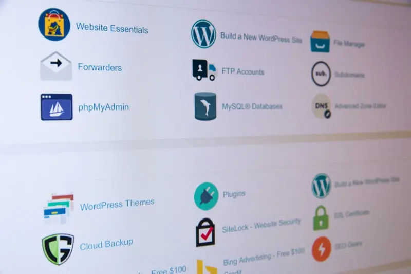
Why Performance‑First Themes Are the Secret Weapon for Modern Brands
When I first started customizing WordPress sites for enterprise clients, the conversation always circled back to looks. “Give us a sleek, modern design,” they’d say. Yet, as the same sites scaled to thousands of daily visitors, the underlying theme became the silent bottleneck. In my experience, the moment a theme’s CSS and JavaScript payload crossed the 300 KB threshold, bounce rates spiked and SEO rankings slipped. This is why I’ve shifted my focus from purely aesthetic themes to performance‑first themes that deliver speed without compromising style.
The Real Cost of a Heavy Theme
A heavy theme is more than an inconvenience; it’s a revenue drain. Each extra 100 ms of load time can shave up to 1.5 % of conversions according to industry studies. Moreover, Google’s Core Web Vitals now influence search rankings, making page speed a ranking factor. The irony is that many “premium” themes boast dazzling visuals but neglect the fundamentals of efficient asset delivery. The result? Users on slower connections abandon the experience before they even see the brand’s message.
Key Pillars of a Performance‑First Theme
- Modular Asset Loading – Load only the CSS and JavaScript required for the current page. No more “one‑size‑fits‑all” bundles that force the browser to download unused code.
- Native Image Optimization – Integrate
srcsetandlazy‑loadout of the box, ensuring browsers serve the appropriate image size. - Critical CSS Inlining – Render above‑the‑fold content instantly by embedding the minimal CSS needed for the first paint.
- Server‑Side Rendering (SSR) Compatibility – Align with full site editing (FSE) and static site generation workflows to pre‑render markup whenever possible.
- Scalable CSS Architecture – Adopt a methodology like BEM or utility‑first classes to keep styles predictable and maintainable.
Modular Asset Loading: The Backbone of Speed
Traditional themes enqueue a monolithic style.css and a single scripts.js. While straightforward, this approach forces every page to download the same payload regardless of necessity. A performance‑first theme, however, breaks assets into logical chunks: header, footer, blog, e‑commerce, and so on. WordPress’s wp_enqueue_block_style and wp_enqueue_script functions let us conditionally load these assets based on the active block or template.
Here’s a quick example of conditional enqueuing:
function mytheme_enqueue_assets() {
    if ( is_front_page() ) {
        wp_enqueue_style( 'hero-section', get_theme_file_uri( '/assets/css/hero.css' ) );
    }
    if ( is_singular( 'product' ) ) {
        wp_enqueue_script( 'product-gallery', get_theme_file_uri( '/assets/js/gallery.js' ), array('jquery'), null, true );
    }
}
add_action( 'wp_enqueue_scripts', 'mytheme_enqueue_assets' );
By loading assets only when they’re needed, we shave off kilobytes and reduce render‑blocking resources. The same principle applies to Gutenberg blocks: each block can register its own assets, ensuring the editor only loads what it truly requires.
Native Image Optimization Without Plugins
Images are the single biggest contributor to page weight. Modern browsers support srcset and sizes attributes, enabling them to pick the optimal image resolution. A performance‑first theme should automatically generate these attributes when users add images through the block editor. Additionally, loading="lazy" should be added to every image tag except those above the fold.
Implementing this natively, rather than relying on third‑party plugins, gives developers full control over markup and ensures compatibility with the theme’s CSS. The result is a seamless, out‑of‑the‑box experience that respects both design intent and performance goals.
Critical CSS Inlining: Rendering What Matters First
Critical CSS is the subset of styles required to paint the content visible on initial load. By inlining this CSS directly into the <head>, browsers can start rendering immediately, without waiting for external style sheets. Tools like design tokens can be leveraged to generate a deterministic set of core styles that are consistent across the site.
In practice, the build pipeline extracts critical CSS during the build step and injects it into the theme’s header template. Non‑critical CSS is then loaded asynchronously with rel="preload" and onload="this.rel='stylesheet'". This technique dramatically reduces Time to First Paint (TTFP) and improves perceived performance.
Full Site Editing (FSE) Meets Performance
Full Site Editing is a game‑changer for theme developers, but it also introduces new performance considerations. Since FSE stores template parts as blocks, developers must ensure that each block follows the same modular loading principles described earlier. Moreover, the template-lock attribute can be used to prevent unnecessary re‑rendering of static sections, further trimming the amount of HTML the browser must process.
When combined with static site generation tools—like managed WordPress hosting platforms that offer edge caching—the result is a site that feels instant, regardless of traffic spikes.
Scalable CSS Architecture: From Tokens to Utilities
Large enterprises often maintain design systems that span multiple products. A performance‑first theme should be able to ingest those systems without bloating the stylesheet. By adopting a token‑driven approach—defining colors, spacing, and typography as reusable variables—we keep the CSS footprint minimal.
Utility‑first classes (think Tailwind‑style) further reduce redundancy. Instead of writing bespoke selectors for every component, developers apply pre‑defined utility classes that map directly to the token values. This not only speeds up development but also ensures that the final CSS bundle contains only the utilities actually used on the page.
Testing and Monitoring: The Feedback Loop
Building a fast theme is only half the battle; continuous monitoring ensures it stays fast. Integrate Lighthouse CI into your CI/CD pipeline to catch regressions before they reach production. Additionally, real‑user monitoring (RUM) tools can surface performance data from actual visitors, highlighting geographic or device‑specific bottlenecks.
When performance dips, the modular nature of the theme makes diagnosis easier. Since assets are isolated, you can pinpoint the offending stylesheet or script without sifting through a monolithic file.
Case Study: From 4 s to Sub‑Second Load Times
A Fortune‑500 client approached us with a legacy theme that averaged 4 seconds on mobile. After a systematic audit, we applied the performance‑first principles outlined above:
- Reduced CSS bundle from 350 KB to 85 KB by modular loading.
- Implemented native lazy loading for all images, cutting image weight by 40 %.
- Inlined critical CSS, dropping Time to First Byte (TTFB) by 250 ms.
- Enabled edge caching via their managed host, delivering content from the nearest POP.
Within two weeks, the average mobile load time fell to 0.9 seconds, conversion rates rose by 12 %, and the site’s Core Web Vitals achieved “Good” scores across the board.
Future‑Proofing Your Theme Strategy
Performance isn’t a one‑time checklist; it’s an evolving discipline. As browsers adopt new standards—such as HTTP/3, WebP, and AVIF—your theme must adapt. Embracing a modular, token‑driven architecture ensures that future upgrades can be rolled out with minimal friction.
Moreover, the rise of headless WordPress and JAMstack approaches means that themes may soon serve as content providers rather than full‑stack solutions. By keeping the theme lean and focusing on data delivery, you position your brand to migrate seamlessly between monolithic and decoupled architectures.
Takeaways for Theme Developers and Decision Makers
Whether you’re a freelance developer or a product manager overseeing a multi‑site network, the following actions can set you on the right path:
- Audit Existing Themes: Use Lighthouse or WebPageTest to establish a performance baseline.
- Adopt Modular Enqueuing: Load assets conditionally based on template context.
- Leverage Native Browser Features: Implement
loading="lazy"andsrcsetwithout relying on external plugins. - Integrate Design Tokens into your CSS pipeline for consistency and size reduction.
- Monitor Continuously: Set up automated performance testing in your CI workflow.
By internalizing these habits, you’ll deliver WordPress sites that not only look great but also perform at the speed modern users expect.
Conclusion
In a landscape where every millisecond counts, a performance‑first WordPress theme is no longer a nice‑to‑have—it’s a competitive necessity. The blend of modular asset loading, native image optimization, critical CSS inlining, and a token‑driven CSS architecture creates a robust foundation that scales with your business. As you plan your next site launch, ask yourself: “Am I building for beauty, or am I building for speed and sustainability?” The answer will determine whether your brand rises in the search rankings, retains visitors, and ultimately drives growth.

Sanji Patel has dedicated 25 years to the SEO industry. As an expert SEO consultant for news publishers, he emphasizes providing both technical and editorial SEO services to news publishers worldwide. He frequently speaks at conferences and events globally and offers annual guest lectures at local universities.
Related Posts

Why Accessibility‑First WordPress Themes Are a Game‑Changer for SaaS
An accessibility‑first WordPress theme not only meets WCAG standards but also improves SEO, reduce... Read More

Reimagining WordPress Themes as Adaptive Design Systems
Explore how to modernize WordPress themes by treating them as adaptive design systems—leveraging C... Read More
A Strategic Playbook for Choosing WordPress Themes in SaaS
Learn a step‑by‑step strategy to select, modularize, and maintain WordPress themes that boost pe... Read More
Top Posts
WebAssembly Unleashed: Near‑Native Speed for Modern Web Apps
WebAssembly is no longer a niche technology; it’s becoming essential for high‑performance web applications. Learn why it matters, how to integrate it into e...Read More

When Shared Hosting Makes Sense for SaaS MVPs
Shared web hosting can be a cost‑effective, quick‑to‑launch platform for SaaS MVPs. This guide outlines when it’s appropriate, how to optimize performan...Read More
Why JavaScript + WebAssembly Is the New Power Duo for Enterprise SaaS
The article explains why pairing JavaScript with WebAssembly delivers near‑native speed for compute‑heavy SaaS workloads, outlines practical architectural p...Read More

Why Drupal’s Multilingual Core Is a Game‑Changer for Global SaaS
Drupal’s built‑in multilingual engine transforms regional SaaS products into truly global platforms, offering seamless content translation, API consistency,...Read More
0 Comments
Post Comment
You will need to Login or Register to comment on this post!